Monday, June 14, 2010

"THE ART DEALERS GALLERY - PERSPECTIVE VIEWS"

These sequences of images show perspectives of the building both internally & externally, and how the people using & passing by the building might experience it.


THE IMAGE TO THE TOP LEFT IS A SECTIONAL VIEW, BUT SHOWS THE THREE DIFFERENT LEVELS OF THE BUILDING OR COMPLEX. THE IMAGE TO THE BOTTOM LEFT IS A PERSEPCTIVE VIEW FROM THE BALCONY ACCESSED FROM THE CAFE AREA AND IS A GOOD INDICATION OF HOW THE OCCUPIER MIGHT EXPERIENCE INTERACTING WITH THE OTHER EXTERNAL SPACES INCLUDING THE AMPHITHEATRE. THE THIRD PERSPECTIVE VIEW IS TAKEN FROM THE LOWERED AMPHITHEATRE AND IS LOOKING BACK UP TOWARD THE OTHER MAIN AREAS OF THE BUILDING, IT WAS IMPORTANT TO ME TO THAT ALL INDIVIDUAL SPACES WERE ABLE TO RELATE TO EACH OTHER.


THE TOP IMAGE IN THIS VIEW IS A PERSPECTIVE VIEW OF THE ENTRY AND HOW THE PASSER BY MIGHT EXPERIENCE THE BUILDING AS THEY PASS BY. THE MAIN ENTRY POINT IS ALMOST PARRALLEL TO THE STREET TO MAKE A RELATIONSHIP TO THE STREET AS WELL AS BEEN DOMINANT OVER THE OTHER ELEMENTS OF THE BUILDING. THE IMAGE AT THE BOTTOM OF THE PAGE IS A VIEW OF WHAT YOU WOULD EXPERIENCE AS YOU ENTER THE BUILDING, I WOULD PROPOSE TO PLACE A PERMENANT INSTALLATION IN THE CENTRE OF THE CENTRAL AREA OF A LOCAL ABSTRACT SCUPLTURE, SOMETHING THAT WOULD EPITIMISE THE WHOLE BUILDING AS BEING A LOCAL COMMUNITY CENTRE, FOR LOCAL ARTIST TO WORK, DISPLAY, INTERACT AND BE INSPIRED BY EACH OTHER.


"THE ART DEALERS RESIDENCE - ARCHITECTURAL MODEL"

The model for this project was made at 1:100 scale and is made from balsa wood the surrounding site is made from box board, this indicates & highlights the actually gallery. The model show how the central foyer entrance area is dominant over the surrounding spaces. and as you would walk past the site it would draw your eye towards the building. i think this indicates my "poche" for the building the central foyer all other spaces are organised around this central space.


THIS IMAGE SHOWS AN AERIAL VIEW OF THE SITE WITH, THE CENTRAL COURTYARD & AMPHITHEATRE ARE OBVIOUS AS WELL AS HOW THE TWO BALCONIES FACE THE CENTRAL COURTYARD & AMPHITHEATRE AS WELL AS BEEN ADJACENT TO EACH OTHER, THIS WOULD ALLOW FOR GREAT INTERACTIONS FROM ALL PARTS OF THE BUIDLING.


VIEW OF THE FRONT OF THE BUILDING AS YOU WOULD SEE IT FROM KING STREET, NOTE HOW THE MAIN CENTRALIZED ELEMENT THE ENTRY FOYER) FACES THE STREET WITH THE GALLERY SPACES LEAVING AN INTERMEDIATE SPACES BETWEEN THE FOOTPATH & THE BUILDING.


THIS IMAGE SHOWS THE BUILDING FROM A DISTANCE, OR HOW SOMEONE WALKING DOWN THE STREET ON THE OPPOSITE SIDE OF THE ROAD MIGHT VIEW THE BUILDING IN RELATION TO THE SURROUNDING AREA.


THIS IMAGE SHOWS HOW THE BUILDING AND IMPARTICULAR THE CENTRAL CORE OF THE BUILDING WOULD CONNECT & RELATE TO THE BUILDING IT ADJOINS TOO. IT HAS BEEN WORKED OUT AS A SQUARE BUT WITH A CORNER OF THE SQUARE REMOVED, EACH OTHER CORNER OF THE SQUARE IS CENTRAL TO ONE OF THE CURVED ROOFS IT ADJOINS.


"THE ART DEALERS RESIDENCE - PLAN & SECTIONOF ROOM AT 1:50"

These images are a plan & section at 1:50 of the entry hall and the larger gallery to show how light would enter the relevant spaces.

THIS IMAGES IS A FLOOR PLAN OF THE LARGE GALLERY SPACE AND ENTRY HALL, INDICATING HOW THE LIGHT WOULD ENTER THE SPACE. I HAVE POSITIONED THE WINDOWS IN THE GALLERY SPACE AS FULL HEIGHT WINDOWS TO LINE UP WITH EACH PASSAGE THAT WOULD DISPLAY THE ART SO TO DIRECT YOU TO THE DIRECTION.


THE CURVED HIGHLIGHT WINDOWS IN THIS SECTION ARE SITUATED ABOVE EACH ENTRY POINT TO THE SPACES OF THE GALLERY AND OTHER AREA SO AS TO ACT AS A GESTURE TO DIRECT YOU AROUND THE BUILDING. THESE HIGHLIGHT WINDOWS WOULD ALSO THROW SUBTLE AN UNUSUAL LIGHT THROUGH THE ENTRY FOYER.

"THE ART DEALERS RESIDENCE - DESIGN"

As discussed in the introduction to this project, i have designed the art gallery & residence around the idea that it would be used locally by local artist and also act as a place where people could come and interact with each other.


THE SITE PLAN AT 1:500, THE FRONT BOUNDARY OF THE SITE IS ANGLED AND I HAVE LEFT A TRANSITION SPACE BETWEEN THE FOOTPATH AND THE ENTRY WITH STAIRS THAT LEAD TO AND ENTER THE MAIN ENTRY HALL.


THE ART DEALERS COMPLEX IS LAYED OUT ON TWO MAIN LEVELS, THE GROUND FLOOR LEVEL HAS THE MAIN ENTRY HALL WHICH IS AT 45 DEGREES IN RELATION TO THE OTHER PARTS OF THE BUILDING AND EVERYTHING IS ORGANISED AROUND THIS. THE RECEPTION AREA IS IN THIS 45 DEGREE ELEMENT, WITH THE LARGER GALLERY TO THE NORTH OF THE MAIN ENTRY AND THE SMALLER GALLERY TO THE EAST OF THE MAIN ENTRY. THE STAIRS TO THE UPPER LEVEL ARE ALSO ACCESSED FROM THIS LEVEL, AND ACCESS TO THE CENTRALISED COURTYARD, WHICH ALSO LEADS TO THE AMENITIES, WORKSHOP & STORE ROOM. I HAVE POSITIONED THE WORKSHOP WITH LARGE DOORS OF THIS AREA SO THAT ARTIST COULD DO DEMONSTRATIONS ON HOW THEY GO ABOUT THERE WORK.
I HAVE ALSO IMPLEMENTED A LOWERED AMPHITHEATRE WHERE PEOPLE COULD DO PERFORMANCE ART, OR WHERE LOCAL PEOPLE COULD JUST COME IN TO THE COMPLEX AND SIT ON THE STEPS AND INTERACT WITH EACH OTHER. THERE IS ALSO A LARGE COVERED OUTDOOR ARE ADJACENT TO THIS THAT COULD BE USED FOR FUNCTIONS OR AS ANOTHER OUTDOOR GALLERY.


THE FIRST FLOOR ACCESSED FROM THE STAIRS IN THE ENTRY HALL WHICH FLARE OUT AT THE BOTTOM AS A GESTURE TO INVITE THE OCCUPANT TO ASCEND, CONSISTS OF THE MEZZANINE LEVEL WHICH PEOPLE COULD BE ON AT THE START OF A FUNCTION AND WATCH AND INTERACT AS PEOPLE ENTERED THE GALLERY ALSO A PLACE WHERE THE PROPRIETER OR ARTIST COULD GIVE AN ADDRESS ABOPUT THE ACTIVITIES OF THE EVENING.
THE NEXT AREA ON THE UPPER LEVEL IS THE CAFE AREA WHICH LOOKS OVER THE GROUND FLOOR OUTDOOR AREA &
AMPHITHEATRE, THIS CAFE ALSO CONSISTS OF A BALCONY SO THAT THE OCCUPANTS ON THE FIRST FLOOR BALCONY COULD INTERACT INDIRECTLY WITH THE PEOPLE BELOW.
AS YOU WALK THROUGH THE CAFE AREA YOU COME TO THE ART DEALERS RESIDENCE. ON ENTERING YOU COME INTO THE KITCHEN AREA SO THAT THE FAMILY COULD PREPARE FOOD FOR FUNCTIONS, THAT WOULD BE EASILY SERVED TO THE CAFE AREA. THIS FIRST SPACE ALSO INCLUDES THE LIVING AREA OF THE RESIDENCE, WHICH ACCESSES A BALCONY THAT ALSO LOOKS OVER THE GROUND FLOOR OUT DOOR AREA &
AMPHITHEATRE. AS YOU MAKE YOUR WAY THROUGH THE RESIDENCE YOU COME TO THE SLEEPING QUARTERS AND BATHROOM WHICH IS ALSO ACCESSIBLE TO THE FIRST FLOOR BALCONY, NOTE HOW THE PROPORTIONS OF THE BALCONIES RELATE TO THERE USE AND ALSO HOW THEY ARE ADJACENT TO EACH OTHER SO PEOPLE ON EACH BALCONY CAN INTERACT WITH EACH OTHER.

Friday, June 11, 2010

"ARCH 1201 FINAL ASSESMENT - THE ART DEALERS RESIDENCE & GALLERY"

The Final assesment for this semester was to design an art gallery that would also be the residence of the art dealer and his family. On spending some time around Newtown and investigating the three site, one thing that really caught my attention was that their seemed to be a really sense of communtiy in & around the area, so idecided that it would be appropriate that the complex would be a centre for local artist to display or perform there art, as well as a place that the local community could come to interact with each other and the family that reside on the property, to discuss art and other points of common interest.

"THE ROOM - MODEL"

These following images of the model, i think clearly indicate the three levels, i should also point out how as the roofs of the upper most (spiritual) and lower most (intellectual) levels move away from those specfic spaces the roofs join as a sign of union of the three levels of existence.


THIS IMAGE SHOWS THE THREE ROOFS OF THE STRUCTURE WEAVING TOGEHTER TO GAIN THE BALANCE REQUIRED FOR
A PEACEFUL MULTI FACETED LIFE. AND IMPARTICUALR THE HOW THE SMALLER WINDOWS OF THE PHYSICAL LEVEL DRAW YOU TOWARD THE CORNER WINDOW WHICH WOULD ENJOY BREATHTAKING WATER VIEWS.


THE THREE ROOFS AGAIN WEAVING TOGTHER ABSOLUTELY INDEPENDENT OF EACH OTHER, BUT ALSO EBERY BIT RELIENT
ON EACH OTHER. ALSO AS THE OCCUPANT WOULD DESCEND FROM THE SPIRITUAL (RESTING) LEVEL THE WOULD ENJOY THE WATER VIEWS AS THEY DESCEND TO THE PHYSICAL LEVEL.


THIS VIEW OF THE MODEL WITH THE ROOFS OF, SHOW HOW THE THREE LEVELS OF EXISTENCE RELATE TO EACH OTHER.


THIS VIEWS SHOWS IN A CLEARER WAY HOW THE THREE ROOFS MARRY TOGETHER
TO FORM THE ONE STRUCTURE .


"THE ROOM - AXONAMETRICS & PERSPECTIVES"

These following images show in more detail how the deifferent spaces might relate to each other, and how the occupants of the spaces might relate to the spaces.


THE AXONAMETRIC IMAGE ON THE LEFT HERE IS RELEVANT IN HOW THE THREE SPACE WORK TOGETHER AND HOW YOU MIGHT MOVE BETWEEN THEM. THE IMAGE TO THE LEFT IS A PERSPECTIVE VIEW FROM THE LANDING AREA OF THE PHYSICAL LEVEL TO THE INTELLECTUAL LEVEL, INDICATING THE EXPERIENCE AS YOU DESCEND.


THE AXONAMETRIC DRAWING TO THE LEFT IS TAKEN FROM THE THE HIGHEST WHAT YOU WOULD SEE AS YOU ENTER THE PHYSICAL SPACE A PLACE WHERE YOU WOULD GO ABOUT YOUR EVERY DAY BUSSINESS, EATING, SOCIALISING ETC. THE PERSPECTIVE IMAGE TO THE BOTTOM LEFT CORNER IS WHAT THE OCCUPANT WOULD SEE AS THEY DESCEND TO THE PHYSICAL LEVEL.

"THE ROOM - CONCEPT TO DESIGN"

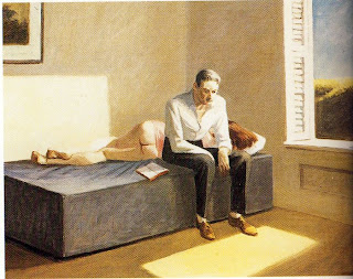
After finalising the narrative for the project, I realised that as discussed in the narrative I believe that the picture was depicting a man struggling with his existence and came to the conclusion that it was very important to have balance in this existence, further I feel that there are several levels of existence and therefore reflected this in the design of the room where the room is on three level's, still one room no walls or doors dividing them only levels.


THE PLAN SHOWS THE THREE LEVELS AND HOW THEY MIGHT BE ENJOYED BY THE OCCUPANTS.

SECTION A-A HERE INDICATES THE SPIRITUAL AND THE PHYSICAL LEVEL AND HOW THEY MIGHT
RELATE TO EACH OTHER


SECTION C-C- I THOUGHT IT WAS IMPORTANT TO SHOW THIS THIS IMAGE THROUGH THE SPIRITUAL LEVEL, AND HOW THE BED WOULD BE WITH THE ANGLED WALL SO AS TOO ENHANCE THE EXPERIENCE AS THE OCCUPANT REJUVENATES THE SOUL.

SECTION B-B SHOWS THE RELATIONSHIP BETWEEN THE PHYSICAL AND THE INTELLECTUAL LEVEL
AND HOW AS YOU DESCEND FROM THE PHYSICAL LEVEL YOU CAN GRAB A BOOK FROM THE
BOOK SHELF ON YOUR WAY DOWN TO THE INTELLECTUAL LEVEL TO FEED THE MIND WITH KNOWLEDGE.

Thursday, June 10, 2010

"THE NARRATIVE"

The man sits & ponders his existence, he explores his physicality through his lust for the woman. The void in his soul remians, so he rengages his environment through his intellect by reading and gathering knowledge through studying, hence the book left open on the bed as if to represent his discontent. Still not enthused or satisfied by his explorations, he sits on the bed and as his mind meanders, he finds himself gazing intermittently between environment outside & beyond, finally as he sees and feels the energy of the sunlight on his foot he reaches a point of realisation, where he understands that contentment is not found in one of the levels of existence but rather, in a balance of the woven fabric of the three.

ARCH1201 PROJECT 2 "THE ROOM"

The Painting I chose to draw a narrative from for this project was "excursions into philosphy" By Edward Hopper. I liked alot of his paintings however I found that this one made my mind wander the most and I came up with several narratives or parts of narratives before i settled on one.
I found the painting was very provocative and although the meaning behind it could never really be known, many interprutations were possible.